Updating the Ebook Cover of Dreamsnake
May 25th, 2012 Dreamsnake is the classic novel by Vonda N. McIntyre that won the Nebula, Hugo, Locus, and Pacific Northwest Booksellers’ Award, and is presently available in ebook form at Book View Café.
Recently Vonda asked if someone wanted to re-do the text on the ebook cover. She was very happy with the cover photo of a cobra by Tanith Tyrr, but wanted an update on the font.
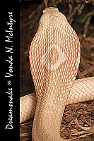
It had been a while since I’d played with Photoshop, so I volunteered. The first image at right is the cover as it was, at the size used for display at Book View Café’s website. The text is silver/gray. The font is Mistral. Vonda wanted an easier-to-read text in white to increase the contrast.
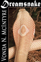
 Being literal-minded, I started out doing exactly what was requested: changing the font face and color, but leaving everything else the same. I also added a tiny line of color between the image and the black panel. The result can be seen at right. The title font is “Matura MT Script Capitals”. I don’t have a big selection of fonts on my computer. I chose this one because it was big, thick, sharp-edged and interesting. The font used for the author name is Mona Lisa Solid ITC TT, which I chose because it uses very tall letters that can be packed close together. I thought the result was interesting, but I wasn’t happy with it. I felt the text was too crowded. To fit everything in one vertical line, I had to make Vonda’s name too small to truly read.
 So I decided to try a half-frame: put the title across the top and let the author’s name have the left column. Of course this left less room for the image of the snake. I decided to keep the image the same width and just crop off the bottom. In doing so I had to eliminate the curve of the snake’s body. I had some doubts about that, but I did it anyway, and I was pleased with the result. The title font was dramatic, the author’s font, “Trajan Pro,” was distinctly different but complementary, and both were very easy to read even at small size.
I sent both versions to Vonda.
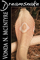
 She agreed with me that the second version was better, but she really wanted that beautiful, curvy snake’s back to be part of the picture. To get the full height of the snake photo, we had to sacrifice width, so the left-hand black panel became wider.
Vonda also wanted something lighter for the title font and gave me a list of suggestions. I’d already tried almost all of them and thought they were too light in weight to make effective title fonts. But then I plugged “Handwriting – Dakota” in, played with it a bit, and really liked the result. The “D” is of course a much larger font size than the other letters. It’s at normal weight, while all the smaller letters are set in a faux-bold that Photoshop allows you to do. Strangely enough, the weights balanced quite nicely. And with their bright white against black, the fonts are very legible, even at small size. This was the final version of the cover, at least for this round!
Dreamsnake is available in epub, mobi, and PDF formats at Book View Café.
Posted on: Friday, May 25th, 2012 at 4:06 pm
Categories: Cover Art.
Tags: Dreamsnake, Vonda N. McIntyre


May 25th, 2012 at 6:30 pm
Linda, thank you for the wonderful redesign of the Dreamsnake cover. I’m so pleased with it!
Vonda
May 25th, 2012 at 6:52 pm
You’re welcome! I’m glad you like it. It was fun to do, and a nice change of pace from writing.