A New Cover for Memory
June 11th, 2011 The cover I designed for Memory didn’t seem to be too popular with y’all, so I asked artist Jenn Reese, a writer herself and owner of Tiger Bright Studios, to come up with something new, and here’s the beautiful result.
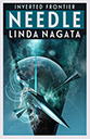
The new cover went live today on Amazon, and should show up at Barnes & Noble before too long. Find the ebook here:
Amazon.com USA
Amazon UK
Barnes & Noble
What sort of cover sells books? I don’t know, but I’m willing to keep experimenting.
Let me know what you think!
Posted on: Saturday, June 11th, 2011 at 4:42 pm
Categories: My E-books, Publishing.
Tags: book covers, Memory
June 13th, 2011 at 11:44 am
This foggy (OK, silvery) thing is a turn-off for me, although the “hints” on the right may draw in some. I prefer the original, even though it shows a “Ringworld” inappropriate to the story.
However, one of the prime aspects to what I like about said original is the definiteness, the sharpness. So I’m going to suggest an alternate subject; perhaps others can offer their opinions, their alternatives. And if you use mine, I expect a _signed_ edition :).
Jubilee and Liam have just come upon the white city (Fiaccomo’s?), reworked by silver, semi-melted, but in my mind’s eye always absolutely white, so white that it’s difficult to visually separate some elements. There may be more and less bright aspects based upon the angle of the sun, but there’s not even a shade of light grey; it’s _all_ white.
They’re friends, never will be more, but there’s still a sexual tension between them. And they’re on exotic-looking bikes, ones that can reshape their wheels in order to climb stairs (nice touch there).
Place them in “high-def” sharpness in the foreground, looking away from the reader’s POV and toward the city. Color their clothing & technology with earthy tones, what you’d wear hiking; perhaps also throw in a splash of attention-getting color, but use _no_ white and no grey. Note that the reader won’t see their faces, so will have to put a personal interpretation to their expressions, their emotions.
Let the visually confusing and sharply defined white city dominate the background, barely enough detail there to tell what it is except in outline. And the “border” beyond the city might be whatever you want; perhaps let the cover depart from the story’s blue sky in order to show that this isn’t a spherical world. Perhaps the Bow of Heaven will be faintly visible….
I see them at the left side of the frame, taking up maybe 30% of the picture, the white city taking up the 50%, and the rest a cloudless electric-blue sky; perhaps there are also forests in various directions beyond, but if so then they’re both low-contrast and low-brightness so as to offer the maximum contrast to the whiteness of the city and the brightness of the sky. _Hyperion_ by Dan Simmons has a similar layout but lacks the emphasis.
I’ve seen some paperback covers that aren’t flat, but instead offer a bas-relief as part of the detail. Perhaps such (well, in paperback printings anyway) can give “detail” to the white city, so that even casual book browsers aren’t misled that there’s nothing on the right two-thirds of the cover.
The contrast between the definite foreground and the less identifiable (but still sharp not vague!) background, and also how I imagine their expressions, suggests to me remembering, melancholy, memory, and also expectation, adventure, the excitement of youth.
That’s my suggestion, and I’m stickin’ to it.
June 13th, 2011 at 12:41 pm
I love it! I’ve never been able to visualize what would make a good cover for this book, but this whole idea appeals to me, and I’m going to keep it in the back of my mind. The first issue of course is money. The new cover is a stock photo manipulation–much less expensive than a painting by an artist who’s familiar with the book! The second problem is how effective the scene would be at thumbnail size. That’s a big factor to consider when the vast majority of expected sales are to be online. That’s why more and more books are coming out with large titles and simple, striking images.
Thanks for giving me a beautiful scene to think about!