Linda Nagata: the blog at Hahví.net


The Nanotech Succession Omnibus Edition – updated

Tuesday, June 4th, 2019

The publication of Edges has inspired many readers to check out the earlier Nanotech Succession novels, and this in turn inspired me to pull together an updated edition of The Nanotech Succession Omnibus Edition.

The omnibus has been available in ebook form since 2012, but now I’ve put a new cover on it, refreshed the back-matter, and added a clarifying subtitle: 4 Classic Novels in a Box Set

“Omnibus” used to be the standard term describing a series of novels collected into one volume. In the modern world of ebook publishing, “omnibus” has generally been replaced by the term “box set.” Personally, “box set” makes my grammatical brain twitch, given that there is no box, and if there was, it should be “boxed set.” But the culture has moved past me, and to please the search engines, I’ve conformed.

The omnibus includes the novels Tech-Heaven, The Bohr Maker, Deception Well, and Vast.

Previously, the omnibus was available only at very limited outlets. It’s still not at Amazon due to their pricing model, but you can find it at Apple Books, Kobo Books, Barnes & Noble, and Book View Café.

If you know anyone new to my work, who might enjoy the full Nanotech Succession ride, I hope you’ll suggest this “box set.”

The detail page is here.

Thank you!

Cover Reveal: The Last Good Man

Wednesday, April 5th, 2017

When I first contacted artist Philippe McNally about creating the cover art for my forthcoming novel The Last Good Man, I told him I was leaning toward a minimalist design rather than a full-cover painting, and that I wanted an illustration rather than photo manipulation because the cover needed the suggestion of a machine element to place it in genre.

And what genre is that? The Last Good Man is a crossover. It’s science fiction because it’s set a few years into the future and deals with technology that is just over the horizon. But it’s close enough to the present time that it works as a thriller too.

I am so pleased with the cover Philippe created!
Click the image to see it in a larger version:

Philippe was very patient during the design process. We traded several emails. I talked more about what I was after, and showed him book covers that I liked. He found more book covers that suggested different design options. We weren’t looking at explicit details of those covers, but at the use of space and the different styles they employed. We gradually converged on the symbolic rendition you see above. Not an explicit scene, but suggestive of the novel’s theme.

I have an advance copy of the print edition and the cover looks fantastic with its matte finish. It also looks great at small size in my e-reader’s library.

The Last Good Man will be published on June 20. It will be available in ebook, trade paperback, and audio editions.

So what’s it about? Here’s the back cover copy:

Scarred by war. In pursuit of truth.

Army veteran True Brighton left the service when the development of robotic helicopters made her training as a pilot obsolete. Now she works at Requisite Operations, a private military company established by friend and former Special Ops soldier Lincoln Han. ReqOp has embraced the new technologies. Robotics, big data, and artificial intelligence are all tools used to augment the skills of veteran warfighters-for-hire. But the tragedy of war is still measured in human casualties, and when True makes a chance discovery during a rescue mission, old wounds are ripped open. She’s left questioning what she knows of the past, and resolves to pursue the truth, whatever the cost.

The Last Good Man is a powerful, complex, and very human tale.

And here’s what Steven Gould says about it:

I asked to see an advanced copy of The Last Good Man: with the caveat that I was very busy and might not get to it. I was just going to glance at the first few pages but looked up to find myself halfway through the book in the wee hours of the morning. Only an early morning appointment kept me from reading on but I finished it the following evening.

Welcome to the future of war. Soldiers on the ground depend more on their augmented reality visors, net connections, and hosts of robotic allies, than their rifles, but as long as they tread in harm’s way, certain things do not change, including collateral damage, ethical challenges, and the grief of a mother, a warrior herself, when her son dies in action.

Set where war’s bleeding edge of technology slams into people’s lives, this is a very human story, brilliantly told.

And from Vonda N. McIntyre:

The Last Good Man is a compelling and subversive novel, told by unique characters, especially True Brighton: sympathetic, prickly, determined, all too human. Linda Nagata has impressive insights into technological advances and their potential effects. Not to mention some very cool invented AI critters…. It was a privilege to read TLGM before its publication.”

If you haven’t done so already, please

[* * cue flashing lights * *]

SIGN UP FOR MY NEWSLETTER.

Through the newsletter I can let you know when The Last Good Man is available for preorder, and I’ll send you a reminder when it’s available to buy.

To see more of Philippe’s work and to view his resume, follow this link.

Going Dark

Wednesday, May 27th, 2015

Going Dark - Book 3 of The Red TrilogyGoing Dark. No that’s NOT my planned career path. It’s the title of the final novel in The Red Trilogy, with another amazing cover by Larry Rostant — and Going Dark is well on its way to publication.

My first drafts tend to be pretty solid, but my initial ideas for a new novel are not. I was reminded of this when I was reading an email I’d written last year, when Going Dark was just getting started. The direction I had in mind for the book at that time changed radically as I worked my way past the opening, and the story is a lot better for it.

Right now I’ve got editorial notes on Going Dark from Joe Monti, my editor at Saga Press, and for the past few days I’ve been working on final revisions. I’m happy to say, the requested changes and additions are fairly minor. But it’s always the case in this process that as I get close to the final-final updates, I’m amazed at the difference even small changes can make. The final polish of a novel is always exciting.

I haven’t yet posted a back cover description for Going Dark, because that needs work. But here’s the tagline:

“No Real Allies, No Fixed Enemies, No Certain Battlefields”

Sound exciting? I hope so!

The Red Trilogy has been a big project. Though I’d written ten prior novels, this is my first real trilogy — not that I planned it that way. It just sort of happened — and now it’s nearly done. For me, anyway! I hope not for you. As the books are published, I hope you’ll come along for the ride. All three books are due out this year. Here are the dates:

The Red — June 30

The Trials — August 18

Going Dark — November 3

Yes, you can preorder!

If you read the books, if you like them, I hope you’ll let other people know. Buzz matters.

And if you’d like to get a look at the opening scene of the first novel, find it here on my website.

Okay, back to those revisions…

Stealth Cover Reveal

Tuesday, January 13th, 2015

This popped up on Twitter yesterday:

CLICK THROUGH TWICE TO SEE IT IN FULL!

Artist is the awesome Larry Rostant.

As it turns out, the covers for both The Red and The Trials are up at Simon & Schuster’s website. The images are small, but you can find them here.

The Red: First Light — Cover Reveal

Tuesday, March 5th, 2013

My newest novel is The Red: First Light. It’s a near-future thriller, with a boots-on-the-ground military theme, and it’s my first science fiction novel in ten years. Read the back cover copy here.

Right about the time I finished the first draft, last September I think it was, I asked my daughter, Dallas Nagata White, if she was interested in doing the cover art. Dallas majored in art in college and works now as a professional photographer. I described the plot of the book to her, and asked if she could come up with some sort of photo art. She readily agreed to work on the cover, but decided to do a digital painting instead of a photo project, since she’d been wanting to get back into painting anyway. She read the book, loved it, and was more enthusiastic than ever, but project after project kept rolling her way and she didn’t really get started until midFebruary…but the result was worth the wait.

Just as a disclaimer, I put the text on the image, so all of you true graphics people, please blame me for any deficiencies! 🙂

And here it is! Be sure to scroll down to see a second image, showing the detail of the face.

The Red: First Light; digital painting by Dallas Nagata White

The Red: First Light; digital painting by Dallas Nagata White

Cover detail for The Red: First Light; digital painting by Dallas Nagata White

Cover detail for The Red: First Light; digital painting by Dallas Nagata White

It’s a wrap-around book cover, but I’m not going to show you the back cover until I’ve figured out the text. Hopefully by tomorrow…

Update: click here to see the full, wrap-around cover.

The ebook will publish in just a few days. The print book will follow. Please use the “New Book Alert” form on the right sidebar to sign up for my very occasional newsletter, and I’ll let you know when The Red: First Light is available.

Weaponry

Monday, March 12th, 2012

Just had to share this detail illustration from the print cover of Hepen the Watcher. On the front cover, the ax is clutched in the hands of my anti-hero protagonist. I like to include a decorative element on the back cover, and the ax seemed ideal, so I tried to separate the layers in the Photoshop master file, and pull the ax out. That didn’t work as well as I’d hoped, so I went back to the artist, Sarah Adams, and asked if she could pull out the detail of the ax, and isolate it for use on the back cover–which is exactly what she did, and overnight too.

The shame is that I can’t show you the full-resolution image because the file is too big. But trust me, it’s awesome. And if you ever need some illustration work, give Sarah Adams a tweet at @sarahadams23

Re-Thinking Cover Art: Round Up

Friday, December 2nd, 2011

A decision to re-think the cover art for my novel The Dread Hammer led to a three-part series on my experiences with cover art, from the point of view of an indie publisher.

Here are links rounding up all three parts:

Re-Thinking Cover Art: The Dread Hammer

Re-Thinking Cover Art: The Cover Concept

Re-Thinking Cover Art: Using Stock Photos

Bonus:
Cover Art Reveal: The Dread Hammer

Re-Thinking Cover Art: Using Stock Photos

Thursday, December 1st, 2011

Stock photos are the cover art solution for many indie publishers.

With royalty free stock photos, you pay a one-time fee for the right to use a proffered image–but you don’t have exclusive use. Anyone else can pay for the right to use the image too, so it’s possible you’ll see your cool cover idea repeated somewhere else. Personally, I think the odds of this are pretty long, so it’s not something I worry about.

Royalty-free stock is traditionally considered cheap—“just a few dollars” is what you’ll usually hear. I’m here to tell you it ain’t necessarily so. If you’re purchasing a standard image at a low-cost agency and you’re only doing an ebook, then yes, you could probably get what you need for $25 or less.

But if you need a photo in print resolution, the price jumps, and if you want to buy rights to a premium photo, the price jumps again, into the $100+ range. From the point-of-view of the photographer selling the rights, this doesn’t sound like much, but for struggling authors gambling that a particular cover design will work, it’s a real investment. And often, just one image won’t do. A good cover might need to combine multiple images, with the cost rising with each addition.

The most expensive image I’ve flirted with was over $400 at Getty Images. Thankfully, the design idea I was toying with didn’t work out.

The great thing about most stock sites is that you can download a low-resolution, watermarked image that can be used to try-out a design idea. The really bad thing about some stock sites is that you can’t make your purchases in cash. You have to buy sets of “credits” and of course you will always end up buying extra credits to cover the required amount . . . and eventually these credits will expire and the stock site will have just taken an extra skim of your money. It’s a very consumer-unfriendly system.

Did I mention that I loathe stock photo websites?

The pricing system is only part of it. The frustration of searching for just the right image is far worse.

Cover for Goddesses & Other StoriesI’ve wasted untold hours looking for images to illustrate an idea I’ve got in my head. Often these searches end in complete failure. I know other people who’ve done well with stock photo images, but for all the time invested I’ve had only two real successes: the background image in the cover of my YA science fiction novel Skye Object 3270a was purchased from a stock site, as were the two images I combined for the cover of my story collection Goddesses & Other Stories.

One huge problem with most image searches is that a search might result in 60,000 matches, but many of the same images will then be shown time after time, on page after page, making the effort to browse seem futile.

A second huge problem is that so many of the photos of people feature models so polished they look plastic, mugging for the camera in bizarrely tasteless ways. This might work for the lowest level of advertising, but it’s probably useless for your book cover.

So yes, stock photos can be used to make great covers, but if I have the opportunity of working with an artist, I’ll take that path every time.

Next: cover art reveal >>

Re-Thinking Cover Art: The Cover Concept

Wednesday, November 30th, 2011

In the last post I talked about the current cover for my fantasy novel The Dread Hammer and why I’m now in the process of replacing that cover. This time I wanted to talk a little more about the actual process of coming up with a cover concept.

As the publisher of this book, I feel it’s my responsibility to give the artist some guidance on the cover. Unfortunately, I’m not an artist, but we do what we can, we do what we must.

My strategy is this: I develop some sort of a concept in my head. Sometimes, (rarely), I already know what I want. Other times, I go to Amazon or Goodreads, and look at hundreds of covers, picking out relevant ones with some aspect that appeals to me. This is how I came up with an initial concept for the new Dread Hammer cover.

One option I never consider is a complex, highly detailed scene, such as an alien cityscape. There are three reasons for this. First, it would be impossible for me to visualize such a scene well enough to describe it to the artist, and also, I couldn’t afford to pay her for the amount of work involved. Finally, since my books are primarily sold online, the detail and artistry would be lost within the thumbnail. So I make it a point to use large, fairly simple concepts.

Once I have a concept in mind, I go out on the Internet and try to find images that convey some piece of that concept. Sometimes these images are from stock photo sites, sometimes they’re from Google image searches. All of them are placeholders. Using Photoshop, I cut out the parts I want and paste them together, twisting, bending, stretching, and re-coloring as it strikes my fancy. It’s the electronic version of pasting together magazine photos like kids do in school. I’m not a visual thinker, so I really need to see things laid out to decide if an idea is going to work or not. None of these images will appear in the final product, so copyright is safe.

The huge drawback of this method is finding relevant images to work with. I have abandoned concepts because I can’t find the right images and so have no way of illustrating the idea in my head. But we do what we can.

In the past, I haven’t gone looking for a lot of feedback during this developmental phase, but this time around I’ve been showing these mockups to people, and the feedback has been enlightening–and frightening. Everyone has a different opinion on what works and what doesn’t. Opinions from people who’ve read the book are entirely different from people who haven’t.

Amusingly, the most consistent point of contention is the weapon to show on the cover. Since it’s stated in the back cover copy and in the first few pages of the book, I don’t think it’s a spoiler to say that the Dread Hammer is a god, not a weapon, while our violent protagonist, Smoke, uses a sword by choice. Naturally, I want to include a bloody sword on the cover, but several people want to see a war hammer instead, since it matches the title. Oh, conundrum!

Soon, I’m sure, I’ll come up with an acceptable idea. Then the concept gets handed off to the artist who will take my sorry little mockup as a jumping-off point to create an original piece of art . . . and then we get to do it all over again for the sequel, Hepen the Watcher.

Next time: Using “royalty free” stock photos.

Next: using stock photos >>

Re-Thinking Cover Art:
The Dread Hammer

Tuesday, November 29th, 2011

The option to change your mind is one of the great advantages of indie publishing.

Of all the steps involved in turning a polished manuscript into a book, the hardest by far is cover design. The purpose of a cover is to catch the attention of people who might read and enjoy the book. To my mind a cover should convey the “flavor” of the story, along with something of the setting and genre in an intriguing fashion that will draw in readers who might like the book but have never heard of you or it.

The Dread Hammer is a fantasy novel, but it’s hard for me to say what sort of fantasy it is. Despite swords and magic, it’s not like traditional heroic fantasy, or sword & sorcery, or a quest novel, or urban fantasy, or any subgenre that I’m aware of. It’s darkly humorous, unconventional, and, at 65,000 words, it’s very short compared to most fantasy novels. I consider it “quirky,” so I decided to put a quirky cover on it.

The image I had in mind was of the main character in an active pose, done in a style of art commonly seen in computer games. I wanted this style because it was different (for a book cover), and a little campy. I hoped it would communicate the quirky nature of the book while being eye-catching enough to pull in the curious.

Original cover for THE DREAD HAMMER
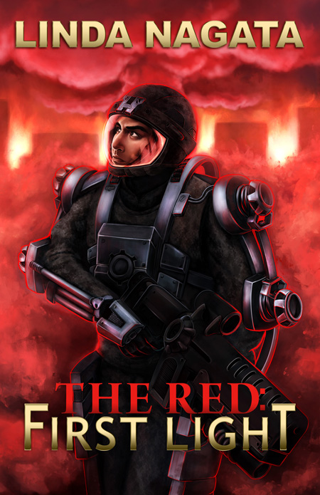
I can’t draw to save my soul, but I do know enough Photoshop to be dangerous, so my method of developing a cover concept is to scour the web for relevant images, slap them together in Photoshop, and amend until I’m sort-of happy with the layout. In the case of The Dread Hammer I put together an extremely rough guide for my artist Sarah Adams, and she gave me back an entirely original digital painting that was exactly what I was looking for. Click the image to see a larger version. This is an impressive piece of work.

But now, seven months after publication, I’m reassessing my initial concept. This is the great advantage of indie publishing. The book is mine, and if I want to change my mind and try different things, I can. So I’m making two big changes: the cover, and my name.

A number of people have persuaded me that publishing under a pen name was never a good idea, so I’m going to re-issue the book under my own name—easy enough.

But changing the cover—that’s hard. What’s wrong with the existing cover? There’s nothing at all wrong with the art itself. I think Sarah did a wonderful job. But sales are slow. I’m not reaching my potential audience, so I’ve begun to think of new ways to frame and present the book—especially important because the sequel, Hepen the Watcher, will soon be ready to follow.

So what do I think is not working with the existing cover? I have no hard data at all, not even anecdotal data, except this one thing: several people have mentioned that the book looks YA—as if it’s aimed at the young-adult market. It’s not. It has adult themes involving family dynamics, personal choice, and personal obligation. It’s also got some fairly graphic sex and lots of very graphic violence. As the tagline says, it’s a “fairytale of love, war, murder, marriage, and fate.”

Besides the YA issue, I’ve come to feel the current cover makes it hard to take the book seriously. This is a guess on my part. No one has told me this. And yes, the story is darkly humorous—but I want it to be taken seriously as literature that is worth one’s time to read.

So I’ve gone back to Photoshop and started patching together new cover concepts. My current goals:

1. Emphasizing the idea of a classic “fairytale”
2. Establishing a general genre setting
2. Creating a visual tension through the intrusion of graphic violence in an idyllic setting

This still leaves an abundance of questions! Which character, if any, should go on the cover? What style should be used? And believe it or not, the biggest question so far has been what weapon to display!

Next: the cover concept >>
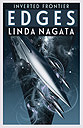
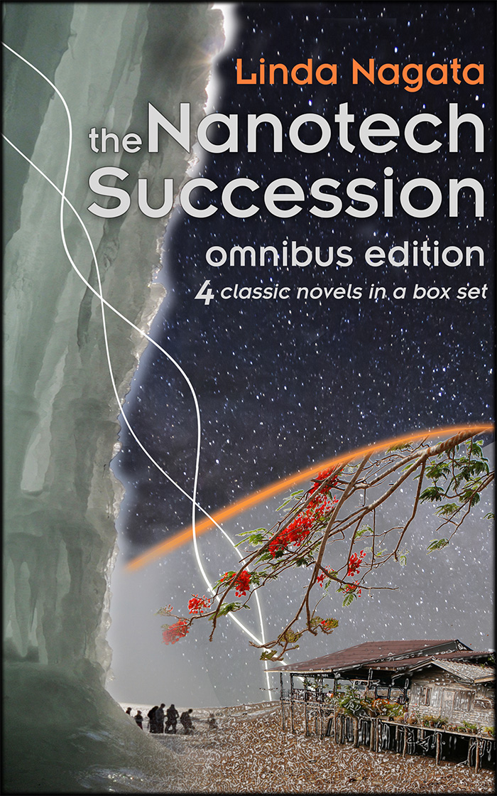