Snippet: Memory
Sunday, September 9th, 2012I lowered myself into the well’s dark throat. The shaft sweated a cold dew. Knobs of jade stuck out from the narrow walls as if they had been put there on purpose to make a ladder. I moved cautiously from one to the next. Jolly and I had climbed every tree in the orchard, we had scaled the wall around the temple at a hundred different points, and we had even climbed up to the roof once, when my father was away and my mother was busy with the new baby. But the shaft was a new experience for me, and I didn’t like it.
I could feel my shirt getting wet, and crumbles of dirt trickling past my collar. The smell of dirt was strong. Beneath that though, there was something else: a sharp scent that made me think of knives, or melting glass. The walls were tiled with the shapes of dormant kobolds. I could see their legs folded against their machine bodies, and their scaled abdomens, but the complex mouthparts that decorated their beetle faces were only half-formed.
I had never seen an unfinished kobold before. I stroked the back of one. Then I pried my fingers into the dirt around its pupal shape to see if it could be freed. It popped loose with surprising ease. I almost dropped it, but managed to catch it with my left hand, while my legs held me propped against the wall.
“You shouldn’t do that,†Jolly said.
I looked up at his foreshortened figure braced across the well’s throat, and I made a face. Out of sight in the well room, Moki was whining anxiously, wondering where we had gone. It was a lonely sound, and did not help my mood, but I had things to prove. So the pupal kobold went into my pocket and I continued down.
[A] kick ass big idea, hard SF novel…Yes, I’m raving. But I seriously love this book.
-–Tobias Buckell


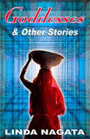
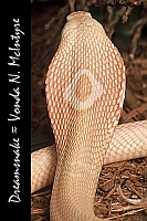 Dreamsnake is the classic novel by Vonda N. McIntyre that won the Nebula, Hugo, Locus, and Pacific Northwest Booksellers’ Award, and is presently available in ebook form at Book View Café.
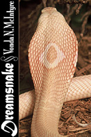 Being literal-minded, I started out doing exactly what was requested: changing the font face and color, but leaving everything else the same. I also added a tiny line of color between the image and the black panel. The result can be seen at right. The title font is “Matura MT Script Capitals”. I don’t have a big selection of fonts on my computer. I chose this one because it was big, thick, sharp-edged and interesting. The font used for the author name is Mona Lisa Solid ITC TT, which I chose because it uses very tall letters that can be packed close together. I thought the result was interesting, but I wasn’t happy with it. I felt the text was too crowded. To fit everything in one vertical line, I had to make Vonda’s name too small to truly read.
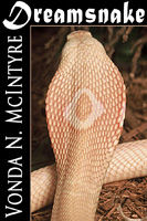 So I decided to try a half-frame: put the title across the top and let the author’s name have the left column. Of course this left less room for the image of the snake. I decided to keep the image the same width and just crop off the bottom. In doing so I had to eliminate the curve of the snake’s body. I had some doubts about that, but I did it anyway, and I was pleased with the result. The title font was dramatic, the author’s font, “Trajan Pro,” was distinctly different but complementary, and both were very easy to read even at small size.
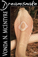 She agreed with me that the second version was better, but she really wanted that beautiful, curvy snake’s back to be part of the picture. To get the full height of the snake photo, we had to sacrifice width, so the left-hand black panel became wider.
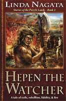
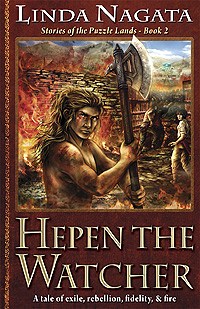 The print edition of my latest novel, Hepen the Watcher: Stories of the Puzzle Lands – Book 2 can now be ordered from Amazon US and UK, and Barnes & Noble. In the next few weeks it should also be listed at Booktopia.com in Australia, and at Powell’s Books’ online store in the USA.
