My Friend, Vonda N. McIntyre
Sunday, February 24th, 2019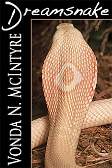 I first “met” Vonda N. McIntyre online, circa 2011. She warmly welcomed me into the writers cooperative, Book View Café, which she had helped establish. It was such an honor getting to know this “big name” writer. Vonda’s 1978 novel, Dreamsnake, had won the Hugo, Nebula, Locus, and Pacific Northwest Booksellers award — at a time when successful young women writers of science fiction were far more rare than they are these days. She also won the 1998 Nebula Award with her novel The Moon and the Sun.
Vonda and I were both website geeks and before long we were working together to develop a new online store for Book View Café.
Eventually, I was very pleased to have the opportunity to meet Vonda in person, over a fine lunch at a shoreline restaurant in her native Seattle. I got to see her again at the Spokane Worldcon where she was guest of honor. Over the years, she’s been hugely supportive of me and my work, something I deeply appreciate.
Just this past week, horrible news arrived. Vonda has been diagnosed with inoperable metastatic pancreatic cancer. Grim, though not quite imminent, as she described it. There is time, and there are treatments to prolong the time and, I hope, to provide quality of life.
None of us knows if we will be here tomorrow, but most of us don’t have to face such a stern diagnosis. My heart goes out to Vonda, and it’s my hope that we will have her with us into the future, and that we will see her next novel before too long.
Find Vonda’s novels here at Book View Café, and while you’re there note the minimalism of her posted bio. That’s so Vonda N. McIntyre. 🙂
 Dreamsnake is the classic novel by Vonda N. McIntyre that won the Nebula, Hugo, Locus, and Pacific Northwest Booksellers’ Award, and is presently available in ebook form at Book View Café.
 Being literal-minded, I started out doing exactly what was requested: changing the font face and color, but leaving everything else the same. I also added a tiny line of color between the image and the black panel. The result can be seen at right. The title font is “Matura MT Script Capitals”. I don’t have a big selection of fonts on my computer. I chose this one because it was big, thick, sharp-edged and interesting. The font used for the author name is Mona Lisa Solid ITC TT, which I chose because it uses very tall letters that can be packed close together. I thought the result was interesting, but I wasn’t happy with it. I felt the text was too crowded. To fit everything in one vertical line, I had to make Vonda’s name too small to truly read.
 So I decided to try a half-frame: put the title across the top and let the author’s name have the left column. Of course this left less room for the image of the snake. I decided to keep the image the same width and just crop off the bottom. In doing so I had to eliminate the curve of the snake’s body. I had some doubts about that, but I did it anyway, and I was pleased with the result. The title font was dramatic, the author’s font, “Trajan Pro,” was distinctly different but complementary, and both were very easy to read even at small size.
 She agreed with me that the second version was better, but she really wanted that beautiful, curvy snake’s back to be part of the picture. To get the full height of the snake photo, we had to sacrifice width, so the left-hand black panel became wider.