Book Cover Critique II
June 8th, 2016Update: added a third version, as suggested by Sharon in the comments.
Madness has struck and I am messing around with cover layouts. Generally, this is a profoundly time-wasting practice, but since I’ve come this far, let me know what you think of these concepts…
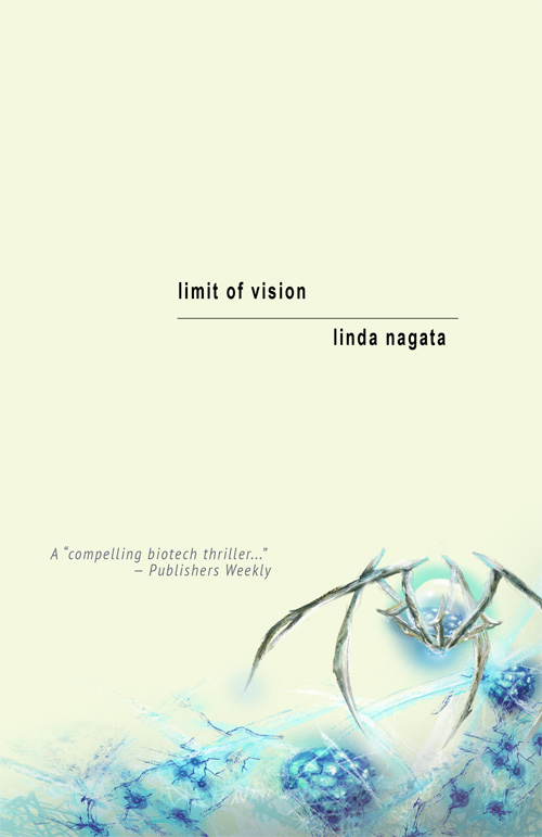
Layout 1:
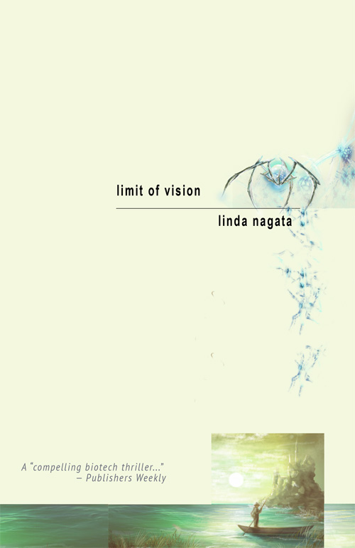
The first one is a mockup. It’s an attempt to position elements to suggest the final cover layout, which would have to be completely re-done by someone with actual art/graphics skills. The small scene at the bottom would need to be repainted. It could be either a very similar painterly scene which fades into flat color, or else an entirely graphics sort of scene. The tumbling debris is meant to link the spider to the dissolving castle structure — and of course the color scheme would need to be adjusted to make a better match between the two elements.
If this was to be principally a print book viewed on a shelf, I would go for even smaller title fonts to suggest that “limit of the visible” idea, but it will be viewed almost exclusively online, so… maybe the font is too small?
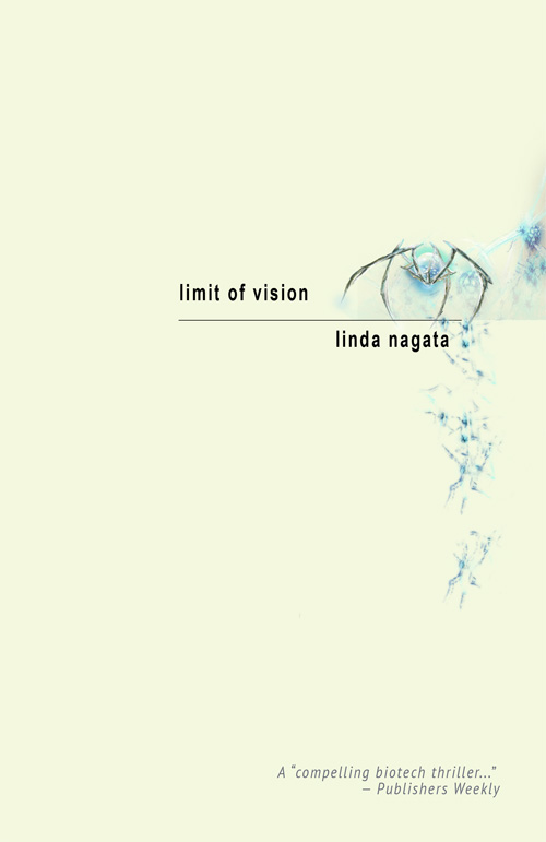
Layout 2:
The second one is even simpler, and I don’t think requires further comment from me except to say that it would be handed off to a graphics artist for final font selection, placement, and rendering. Please let me know what you think!
Layout 3:
Suggested by Sharon in the comments…
Posted on: Wednesday, June 8th, 2016 at 8:33 am
Categories: Cover Art.
Tags: Limit of Vision
June 8th, 2016 at 11:39 am
Hmm… no one has commented here on the blog, but I’ve had two thumbs up on Layout 2 via Twitter and email. Would really appreciate comments, thumbs up or thumbs down.
June 8th, 2016 at 12:02 pm
I like version 2 better – the different “feel” of the bottom visual in version 1 didn’t sit well with me (even were it to be repainted) – but to be honest, I’d like version 1 without boat/water graphic on the bottom, just the cascading blue bio-essence in a straight line down. Very clean, very evocative. In version 2, I would have the testimonial tucked down further in the corner (forgive me if this is what the graphics artist would do… I have no knowledge of the process). But hey – thanks for asking! It’s a rush thinking I could be of even the tiniest of help! Can’t wait to read it…
June 8th, 2016 at 12:10 pm
Thanks Sharon! I appreciate the feedback. This is actually a backlist book, originally published by Tor. It’s been through different covers. I’m still trying to find the right one.
June 8th, 2016 at 1:06 pm
Layout 2 is good, and I think Sharon’s idea for Layout 2 modified into Layout 3 is very good.
June 8th, 2016 at 1:13 pm
Thanks, Paul! My concern with #3 is that the spider might be lost when the cover is seen as a thumbnail.
June 8th, 2016 at 1:28 pm
The existing cover’s main weakness is the lack of engagement. The woman is looking off to the side and there is no emotional connection to the viewer. Repairing that lack would require a pose that is closer to face-on. An example of what I mean is the Red trilogy covers. That guy may not be facing the viewer, but all three poses grant us a window into his soul — we know he’s a military guy contemplating his recent and/or pending involvement in dramatic action of some sort. What you need in the Limit of Vision cover is something that says it’s a thriller. The graphic approach you’ve turned toward has much more potential. I’d say the third and last is the strongest. Simpler. More impact. Looks like the sort of covers that the New York publishers have been using for thrillers in recent decades.
June 8th, 2016 at 1:32 pm
Thanks Dave! As mentioned above, I’m concerned how #3 would play as a thumbnail. Do you think that’s an issue?
June 8th, 2016 at 1:58 pm
In a brick-and-mortar bookstore, covers sell books. On-line, thumbnail covers aren’t there to play that same role of seduction. They play a different role — I call it reassurance. A potential customer finds the book through various means, such as reviews, searching on your name, searching by category, following up on a recommendation, etc. When they get to the page where your book is for sale, all they need from the cover is to see that it looks like the packaging they expect of the kind of product they are after — the right genre, professional presentation, and so forth. Reassurance. They click on the “Look Inside” function, see the large-size version of the cover, and evaluate it in that form. Please don’t worry how much detail is visible at the thumbnail level.
June 8th, 2016 at 3:10 pm
Dave, thank you. I haven’t been following indie cover design conversations in sometime, so this explanation is definitely “reassurance” for me. Thanks for sharing.
June 8th, 2016 at 3:11 pm
I disagree with Dave. The thumbnail image is very important. Readers come across books in various ways and may be gone if they haven’t any particular reason to hang around. The thumbnail can be the hook that gets them to take a closer look. Consider Amazon’s “Customers Who Bought This Item Also Bought” links, which are just a thumbnail and a name.
Oh, and I like #2.
June 8th, 2016 at 3:18 pm
Thanks, Clyde. That’s been my instinct and my concern, although I haven’t followed the debate in some time.
June 8th, 2016 at 3:49 pm
I think #2 works very well. minimal and uncluttered. the spider evokes some nicely dramatic biotech elements and i like how it is placed to bleed off the bottom of the page margin (as if it is invading the page). color scheme is very modern as well and again, minimal.
i would agree with some above, much as LP art was squeezed down into a smaller CD format, with the thumbnail prevalence and ‘look inside’ aspects mean you may want to make the title larger for the change in scale.
June 9th, 2016 at 6:55 am
I like #2 the best, followed by #1. #3 is just too sparse.
June 9th, 2016 at 2:41 pm
Thanks Todd and Ron! The feedback is appreciated!
June 11th, 2016 at 7:46 am
#2 is my favorite as well. The larger graphics would read better in thumbnail view than the graphics in #3. The university press for whom I do most of my graphic design work always wants the title size bumped up for easier reading as a thumbnail; I would suggest a slightly larger title/author name for that reason.
June 11th, 2016 at 9:15 pm
Thanks Holly! I’ve sent it off to my graphics designer and am eagerly looking forward to seeing what she comes up with.
June 12th, 2016 at 9:36 am
2 and 3 are fine on the graphics, but the text is way too small. When I squeeze the covers down to thumbnail size, I can’t read the title or author. Like I said on the prior page, make those as least as big as your nanotech covers.
June 12th, 2016 at 9:47 pm
There seems to be quite a split of opinions on thumbnails. I’ve read in other places what Dave has said, that seeing the title on a thumbnail is not all that important. Amazon, for example, prints the name of the cover right under the thumbnail, so it seems as if a striking image is more valuable, but… it would be a hard point to prove given how many factors play into a buyer’s decision. At any rate, my graphics artist has done a really striking draft that includes increasing the size of the titles. But she wants to play with it some more. More soon!