Book Cover Critique
June 7th, 2016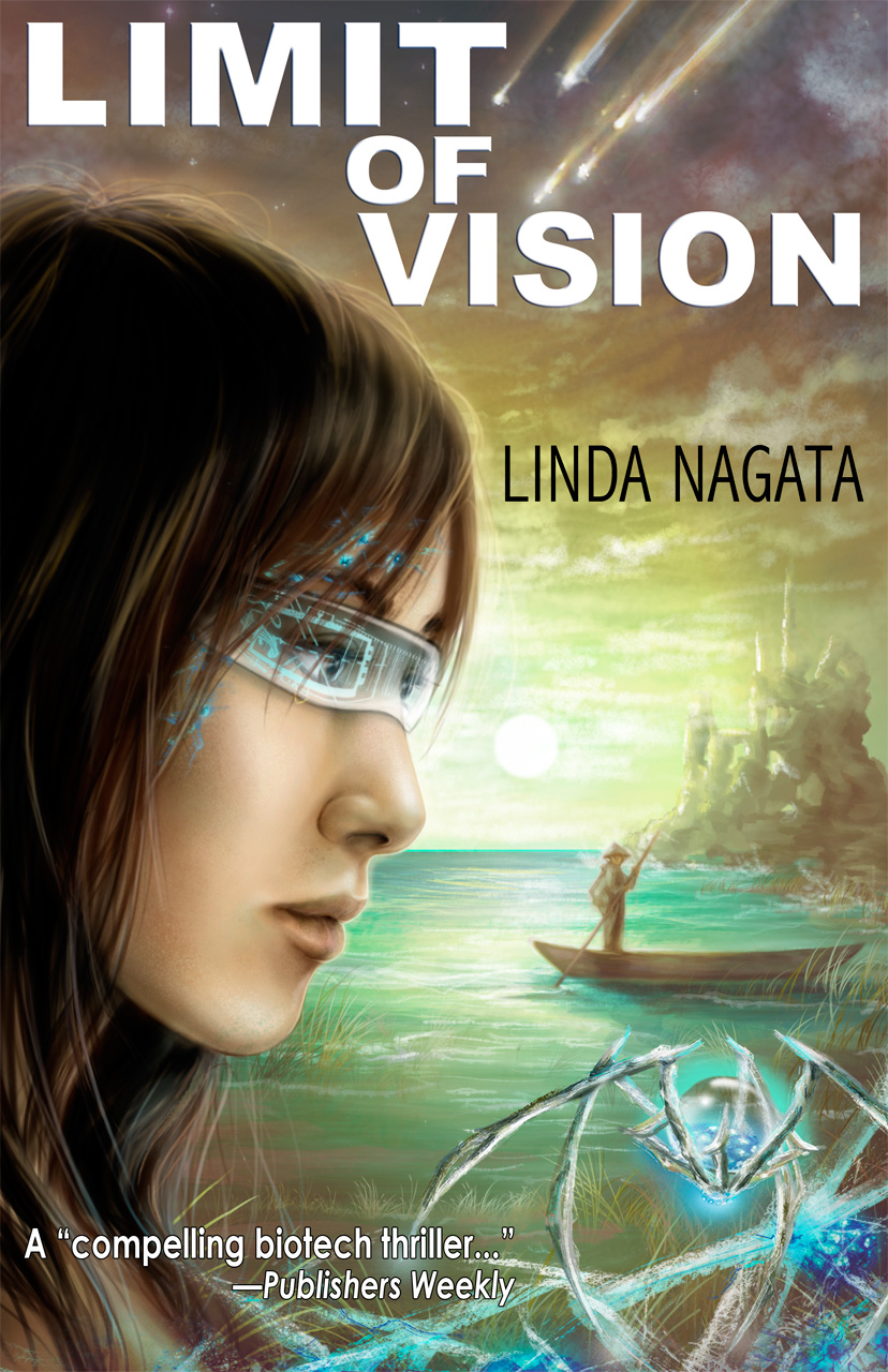 Back in 2011 I set out to develop a new cover for my stand-alone novel, Limit of Vision. I put together a rather laughable mockup of a cover concept. Artist Sarah Adams went on to turn it into a beautiful digital painting. I then added some clumsy title graphics, and the result is the cover you see at right.
There is so much that I really love about this cover art: the rendition of the landscape, the color scheme, the plummeting space debris, the foreground artifacts, and the spidery entity which is rendered so much better here than in the original Tor Books cover. And yet — though this layout is exactly what I asked for — I’ve never been really comfortable with it. Now I’m starting to think of doing a print or audio edition of this book, so I’m reconsidering the cover.
If you’re not familiar with Limit of Vision, this is a near-future, high-tech story set mostly in Vietnam. The two primary characters are an American scientist who instigates an incident of runaway biotechnology, and a Southeast Asian journalist who finds her life overtaken by that. It’s an adult novel, meaning that it’s not young adult.
We all like to think that the right cover will sell a book, and sometimes it’s true. So a general question for those willing to offer an opinion: is this the right cover? My own concerns go to the foreground figure. The portrait is meticulously painted, but is it too large? too dominating? Is it too suggestive of a young-adult novel?
Here’s a look at the cover painting without my amateur graphics:
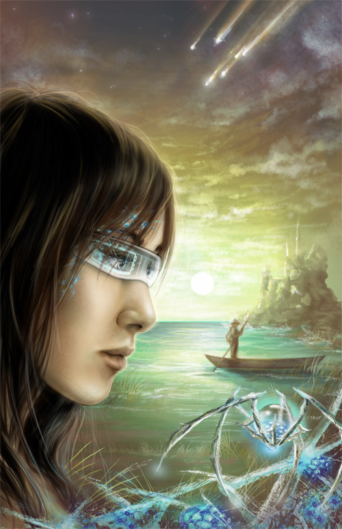
And here’s what it looks like without the foreground figure:

Here are some options I’m looking at:
(1) Have a graphics designer fix up the fonts and it’ll be fine
(2) Eliminate the foreground figure, but keep the background — and get a graphics designer to fix the fonts.
(3) Start over.
I’d appreciate opinions — and opinions need not be limited to these options. Thank you!
Posted on: Tuesday, June 7th, 2016 at 11:20 am
Categories: Cover Art.
Tags: Limit of Vision
June 7th, 2016 at 11:47 am
I feel that the foreground figure dominates the image a little too much. However the picture without her doesn’t really work for me either. Maybe some overlapping frames one with her and the other with the landscape?
June 7th, 2016 at 11:55 am
A few thoughts:
The background painting is lovely, & I’d say keep it if possible. The foreground figure is nice (& it’s nice to see a women on an SF cover!), but feels a bit too visually heavy, making it feel unbalanced. Taking her out might be the better choice.
With the foreground figure gone, I’d recommend flipping the background so it’s mirrored. Then the image would lead the viewer’s eye towards the inside of the book (the lines & lighting directing the eye to the right), and that could be enhanced even more with how the new text is laid out.
Hope that’s helpful for you! 🙂
Tanya
(GundamCat13 on Twitter)
June 7th, 2016 at 12:32 pm
Hi Linda.
Without the foreground figure, there is too much negative space in the image and a lack of clarity as to what its about. On the other hand, the image as depicted does skew, good or bad, toward YA.
And yes, the typography could definitely, definitively be improved.
June 7th, 2016 at 1:54 pm
Agree that the face is necessary but dominates too much. I’ve seen some lovely book covers lately that use overlay effects of mist/fog/frost with unmisted/frosted/fogged peeking out. See the winner here for eg: http://www.thebookdesigner.com/2016/02/e-book-cover-design-awards-january-2016/
Maybe your space junk could be less literal, more metaphorical and obscure some of the girl’s head. Maybe it’s a job for a Photoshop designer wizard. HTH.
June 7th, 2016 at 6:07 pm
I didn’t think much of this cover when I first saw it, and I think the problems you’ve brought up are why. Taking the face out doesn’t work for the reason Paul gave you. On the other hand, is this really going to make or break your book sales?
I think if you want a better cover, you need to start from scratch, and maybe let the artist have more freedom. The cover doesn’t have to tell you what’s in the book–it just needs to be attractive and not violently clash with what’s in the book.
It would really help if the woman were _doing_ something, too, not just sort of being there with fancy glasses.
June 7th, 2016 at 9:55 pm
THANK YOU for the feedback, everyone! I really do appreciate it. And Susan, thanks for the link to those book covers. All the more reason to think this one needs reconsideration.
Ted your question is the pertinent one: What effect would any of this have on sales? Sales right now are so low, that having a negative effect on sales really isn’t a concern. So basically, it’s a question of what is a practical investment for a new cover, and would that get me something more appropriate? I don’t imagine that any cover is going to produce a sudden bestseller, so cost matters.
Anyway, it’s definitely beyond me to do any work with layers or graphics or negative space. I either have a graphics artist re-do the titles (with or without the face), or start all over.
Over on Twitter I had two strong votes on starting over clean. With Ted that makes three, and that’s the direction I’m inclined to go. I’m just entirely unsure how to proceed, because I have no idea what a good cover for this book would look like. As I mentioned above, I came up with the idea behind this design, but that was to give the artist something to work with as we were both pretty uncertain.
Anyway, more opinions, ideas, or recommended artists are absolutely appreciated. Thanks again!
June 8th, 2016 at 5:19 am
What would a good cover be? It seems as if the cover you have is trying to capture the theme of limits of vision, but isn’t doing a very good job of it. I think that’s going to be a very difficult theme to capture; if that’s what you really want, I think something more like the Bohr Maker cover would work better–abstract, attractive, vaguely alluding to the topic, but not depicting any specific scene in a way that is readily identified at a glance.
The other way to go would be to pick some macroscopic scene from the book that you really can draw a picture of, and draw that. Something fairly alarming would seem like a good choice. The giant nanotech spiders are difficult to relate to–ISTR that the original version of the book had something like that on the cover too, and it was actually a bit off-putting–I remember buying the book because it had your name on it, and then not reading it for six months because I couldn’t relate to the cover. When I read the book, I remember wondering why the cover had that particular stuff on it.
A cover that shows a scene that’s from the book, and that leads to an interest in the theme of the book, but doesn’t have so much not-yet-common state in it might work better.
June 9th, 2016 at 6:49 am
I agree with Ted. I was kept from reading the book due to its cover, but I purchased the book because I like your writing. I enjoyed the book once I did read it! I’m not sure why I didn’t like the cover, because as you explained it part by part, it made sense (but I have already read the book….). I’m thinking more abstract is needed. Good luck!
June 9th, 2016 at 2:42 pm
Thanks Ron! I’ve wondered how many people were put off by the cover.
June 11th, 2016 at 1:24 pm
With covers, you need to build it around the text: Title, Author, etc… Look at the simplicity of your original nanotech covers, and go for that. You don’t need to tell the whole story on the cover.
I collected sample covers for years, filling a folder. When I read an Obit in the NYTimes I realized that most of the covers I liked were by Paul Bacon.
http://www.nytimes.com/2015/06/11/business/paul-bacon-91-whose-book-jackets-drew-readers-and-admirers-is-dead.html
Google Images: “paul bacon book covers”
I’m playing with simple covers and adding a touch of graphics rather than trying for a full blown Michael Whelan book cover. HA!
Google Image: “hunt for red october book cover”
And look at the original white cover as an example, compared to the complexity of some of the other covers that you see on the results page. It does not take much to have a good cover, and it’s all too easy to go overboard on the design.
Wiki : Blender (software)
And look at YouTube for “blender tutorial” to see what you can do and how astonishingly simple it is to create something nice if you want something fancy to add to a simple cover.
June 11th, 2016 at 9:35 pm
Hi Allyn. I didn’t know you did book covers. Did you see the follow up post to this one? If you look there, you’ll see that I headed toward a really minimalist look. I’ve sent the idea to a graphics designer, so I’m looking forward to seeing what she comes up with.
June 12th, 2016 at 9:34 am
“Linda said: Hi Allyn. I didn’t know you did book covers.”
I try to duplicate covers I like, with variations, to get the feel for the “language” of the covers.
Go to the Amazon page for “The Bohr Maker” and look at the thumbnail images they use for “Frequently Bought Together” and “Customers Who Bought This Item Also Bought”. The first images are even smaller than the other.
On the page I see the “Frequently Bought Together”, they show “Bohr Maker”, “Going Dark” and “The Trials” thumbnails. “Bohr Maker” is clear even at that size, the other two are just a title with a vague image behind it, no author name visible.
To compare apples-to-apples, in the “Customers Who Bought This Item Also Bought” look at the paperback thumbnail of “Vast” and see how clear it is versus the thumbnail for the mass market edition.
Now look at the Amazon page for “The Sorcerer’s Daughter: The Defenders of Shannara Hardcover by Terry Brooks” and look at the thumbnails in the “Frequently Bought Together” part. From those thumbnails I have no idea what the picture is much less the title. Until I bought the books and held them in my hand I could not see that they were people holding swords.
I like having all the text visible on the thumbnail, then have some surprise at full size.
Look at:
https://www.amazon.com/Liseys-Story-Stephen-King/dp/0743289412/
The dust jacket has a cutout that shows the cover underneath.
https://www.amazon.com/Quark-Jaguar-Adventures-Simple-Complex/dp/0716725819/
The dust jacket is transparent with the picture of a jaguar underneath.
Remember: The Amazon pages are your friends when it comes to understanding book cover design. HA!
June 13th, 2016 at 10:10 am
I stumbled across this book and the covers struck my fancy.
https://www.amazon.com/Sleeping-Giants-Themis-Sylvain-Neuvel/dp/1101886692/
In the “Frequently Bought Together” thumbnails the three books look simple, then when you go to the larger view you can see complexity. They look clear at thumbnail then reveal more texture/structure at full scale.
Very nice. I’ll see if I can duplicate those.
June 20th, 2016 at 10:06 pm
Hi Linda. It’s been some time since I visited your site – it’s looking good – I like the new banner and background.
With regards the LOV book cover, I think in general it’s a vast improvement on the previous covers. The background image is beautiful – I think you should definitely keep it. I also think you did a fantastic job on the type – nothing wrong with it at all.
I think the figure in the foreground is fine as far as placement goes, however I dislike the drawing itself – it feels cold, like a plastic statue – something I’ve felt about many of the other portraits on your covers. I think you should keep the background and the type, and have an artist render a warmer foreground image.
That’s my 2 cents :-).
Regards
Robert