For Indie Publishers:
A Print Book Experiment
February 16th, 2013
 For indie publishers, there are several options for creating a print book. Like most of us, I go with print-on-demand, and I’ve used both of the two big players in the field: Lightning Source, an Ingram company, and Createspace, an Amazon company.
I’ve done print versions for seven of my nine novels, all of them through Lightning Source. LS is not nearly as user friendly as Createspace, it’s much more expensive upfront, and it gets extra costly if you have errors in your files and have to re-submit them. But the default distribution at Lightning Source is better than the default at Createspace, and the pricing structure allows me to price the Lightning Source books lower. Also, to be blunt, it’s not-Amazon. While I don’t know this for a fact, I’ve been told that independent bookstores will not stock Createspace books because they are Amazon.
A couple other differences–
First, you can get a matte cover at Lightning Source. If you can do that at Createspace, I haven’t figured out how. And second, in my opinion, the “creme” colored paper at Createspace is too creamy; it has too much color in it, compared to LS. (For novels, creme paper is generally preferred over white. The creme/white option is available at both companies.)
That said, I’ve successfully used Createspace for two books, and if you’ve never done print books before, I recommend it. It’s a much friendlier and more forgiving place to experiment.
The first book I did at Createspace was a collection of all my short stories originally published prior to 2001, called Goddesses & Other Stories. I wanted a print version, but since I didn’t expect to sell very many copies, I decided to keep my upfront investment to a minimum and go with Createspace. It’s worked out fine, but because of the CS pricing structure, it’s my highest-priced print book so far.
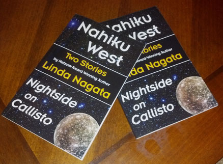
My second CS book is pictured above. Two Stories: Nahiku West & Nightside on Callisto and has just gone live at Amazon. It’s a mini-book: fifty-six pages long, and includes two science fiction short stories, both originally published in 2012. I don’t expect to sell many copies of this one either, and despite its size, it took a significant amount of time to put together–so why bother? Primarily because it’s an inexpensive way for me to experiment with a new print layout.
All the other books I’ve done have shared the same font and page layout, varying primarily in title fonts, header fonts, and very slightly, in the margins. But I’ll be publishing two more novels soon, and wanted to try a new layout. Two Stories was the perfect opportunity to experiment. Fifty-six pages was short enough that I could easily re-do it if I needed to, but it was quite long enough to let me know if the layout would work for the novels–and it wouldn’t cost be any cash upfront to run the experiment.
Stage 1 is now complete. I like the new layout. Stage 2 will involve applying the layout to my forthcoming novel The Red: First Light. Having run the experiment, I’ll be far less anxious over that, when it comes time to submit the print files to Lightning Source.
Posted on: Saturday, February 16th, 2013 at 1:32 pm
Categories: Publishing.
Tags: Createspace, Lightning Source, The Red: First Light, Two Stories
February 17th, 2013 at 1:57 am
I hate to bring this up, but the typography on that cover is really not helping it. I would look at it and not read (the cover) it because of the typography. There’s too much balance—nowhere for the eye to go. Your name doesn’t stand out—I’d recommend putting it at the bottom, not in the middle.
And then what’s at the top should be something that tells the reader what they are buying. Two Stories would be fine, in larger print, then Nahiku West and Nightside on Callisto afterwards, in smaller print. I would put Nightside on Callisto first, since Nahiku West doesn’t really sound like a title—it sounds like a place.
Or you could just title the book “Nightside on Callisto” with “two stories” as a subhead. I guess there’s a chance someone won’t buy it because they already have Nightside on Callisto, but that seems like a small risk.
Finally, more picture, less text. There’s way too much text on that cover, per unit area. Smaller fonts will help, but some of the text should be in really small fonts that the eye only sees if the rest of the cover has perked the reader’s interest.
Anyway, I’m sorry to dump unsolicited advice on you, and you should take it as being worth what you paid for it, but when I saw that cover my first thought was “no-o-ooo-oooo!”
February 17th, 2013 at 8:47 am
Thanks! (I think.) 😉
I get almost no feedback on this sort of thing, so it’s interesting to hear thoughts on it. In a recent article I read on cover design for online books, conventional wisdom was turned on its head when the book designer claimed that title and author’s name do not need to be readable at thumbnail size, because at Amazon, the title and author’s name are printed under the thumbnail anyway. The thought here was that the eye-catching image was the only draw that mattered.
Anyway, this book will likely last only until I have enough stories to put together another full-fledged collection. Then I’ll get serious about cover design!